Bloom Big Headline
An official website of the State of Georgia.
The .gov means it’s official.
Local, state, and federal government websites often end in .gov. State of Georgia government websites and email systems use “georgia.gov” or “ga.gov” at the end of the address. Before sharing sensitive or personal information, make sure you’re on an official state website.
Still not sure?
Call 1-800-GEORGIA to verify that a website is an official website of the State of Georgia.
February 27, 2023
In the coming months, websites on Georgia’s GovHub platform will switch to Bloom, a fresh, new look with updated typography, colors, and layout elements. On the backend and under the hood, this update streamlines our codebase and makes the publishing interface more intuitive for editors. Best of all, we’re handling most of the conversion, so it will require very little effort from content managers.
The goal of this makeover is to create a more modern, aesthetically pleasing design with an improved experience for all users. As much thought has been put into how content editors use the platform as what end users see.
It’s been six years since the inception of GovHub’s current theme, called Forest. “So much of what was considered modern web design has changed since then,” said DSGa product manager Jasmyne Epps. “We felt it was time for a refresh.”
We have been collecting user feedback about the Orchard Design System for several years. Since the changes are rolling out in phases this spring, this next iteration of the theme is named Bloom to continue our homage to Georgia’s natural beauty.
The focus was on reducing unneeded white space, adding more dimension and creativity to content elements, and creating an overall look that aligns with digital trends.
“This is a shift to a more progressive and modern look. It’s lighter and brighter and less complex,” said Rachel Hart, DSGa’s UI/UX lead.
With this rollout, you can expect to see a visual refresh of fonts and layout components, as well as the elimination of unnecessary code and publishing options that often tripped up backend users.
While there are some tweaks, the fundamental way editors create, edit, publish, and manage content remains unchanged. The design refresh won’t require a migration of a site’s data and content. And best of all, it won’t require a lengthy undertaking by content managers.
We'll be contacting agencies to review a brief onboarding checklist and to schedule their Bloom update. Special attention will be paid to Landing Pages and Program & Service Pages, as those are the most likely to need manual tweaks to best use the new design elements.
Bloom brings a lot of changes that simplify the content creation experience. Here are a few of them:
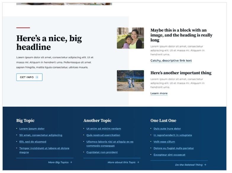
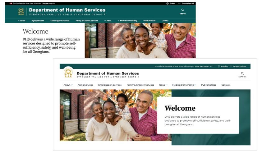
Hero: Heroes have been reimagined and redesigned to be much more inviting, with an emphasis on choosing an appropriate and large image to pair with simple intro text. Instead of being reusable micro-content, a Hero is now part of creating a Landing Page. This better reflects how most content managers use the Hero feature, which is to display the most pertinent information at the top of the page.
Landing Pages: Landing Pages also have been streamlined to reduce complexity when creating them. The Automatic option will give editors a design treatment as soon as they place a section, eliminating the need for additional styling decisions.
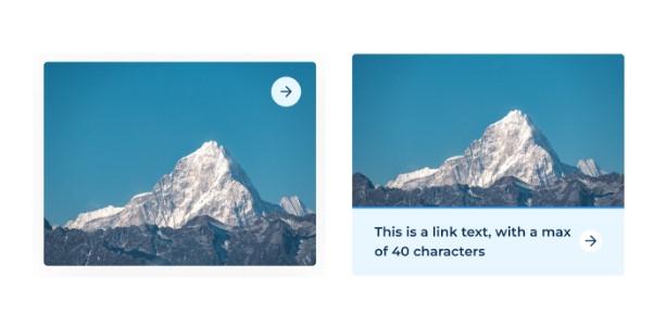
Tiles: The tile micro-content type options have been simplified. Instead of 3 choices, editors may now choose either Image or Image with Text, which reduces redundancy.
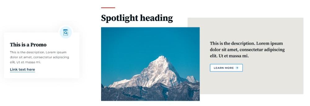
Text Blocks, Promos, and Spotlights: The same concept of streamlining options carries through to Text Blocks and Promos. Since they essentially contain the same kind of content, Text Blocks will be migrated to Promos, which will have only one style treatment rather than multiple. A new micro-content type called Spotlight replaces what was formerly called Promo “Big Description.”
Wondering why and how we made all these design decisions? It was no small undertaking.
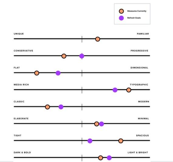
Our discovery process for the new theme included identifying Forest’s shortcomings to better understand where improvements could be made. We then collaborated with designers from our development partners Lullabot using the research to develop the vision for the new theme. We also created a set of design attributes that would become guiding principles as the team went through the redesign process.
These attributes included things like increased accessibility, reducing visual clutter, and simplifying decision-making for content creators.
Ultimately, we wanted to create a modern, inclusive, and inviting digital space for visitors. This included fostering an environment that could be consumed in various ways and that would provide helpful services without being intimidating. The overall intention is to reduce complexity for editors and present less cruft to site visitors.
The team implemented several steps to make the new theme future-facing, intriguing, and engaging. These steps included reducing decision points and complications for editors by carefully considering background colors, font sizes and design treatments. Additionally, we eliminated unnecessary code that could negatively affect performance on the front end. Part of the redesign also involved reimagining content types while simultaneously saying farewell to others that had outlived their usefulness or become outdated over time.
Primarily, GovHub's design refresh seeks to promote an atmosphere where people feel welcomed when engaging with their government online while also offering helpful services without being overly cumbersome or intimidating in any way.
Through these changes, we hope to make creating content on GovHub easier and more efficient for everyone.