September 14, 2023

GovHub in Full Bloom: A Before & After Design Reveal

Are you a fan of those reality TV home makeover shows? If so, get ready for a similar thrill because GovHub, Georgia's website platform, has had an exciting design transformation. Our new design theme, Bloom, is all about freshness and appeal, with updated typography, colors, and layout elements. So, grab your virtual hard hat and join us in this blog post as we do the big reveal, showing you the before-and-after home pages for three different agencies. All of these agencies were already on GovHub, so they looked good from the start, but wait until you see what they look like now.

The Need for a Refresh

First, a quick reminder of what has changed and why we did it. 

After 6 years of the original design theme we termed “Forest,” we decided to roll up their sleeves and take on a more progressive, modern look. Just like a home renovation breathes new life into an old house, Bloom is all about giving the content creation experience a fresh start. We're cutting through the clutter of the digital world and aligning with the smartest trends. Think of it as clearing out the attic: we're rethinking white space, adding a dash of creativity to content elements, and waving goodbye to those complex, outdated features that just don't spark joy anymore. The end goal? A design that's lighter, brighter, and far less complicated, boosting the overall user experience.

And Bloom isn’t only about what things look like on the surface. This website design update gave us the opportunity to clear out technical debt so that the system operates better. Often, technical debt accumulates as software is developed over time. A fix meant to address one issue may cause something else to need attention. Developers keep writing more code to achieve the desired or required results. It’s a continuous process of iteration and building upon previous work. With Bloom, our team of designers and developers could step back and look at the platform holistically to potentially find more efficient solutions than what had evolved along the way.

Key Changes in Bloom

Hero Redesign

Imagine the Hero section as the front porch of a house. It's the first thing visitors see, and it sets the tone for the rest of their visit. The same way a fresh coat of paint, a few potted plants, and some inviting porch furniture can transform a home’s curb appeal, our Bloom makeover has completely reimagined the Hero section. Now, it's all about choosing a big, beautiful image that pairs perfectly with some simple intro text. This new approach boosts the visual appeal and creates a warm, welcoming feel.

Streamlined Landing Pages

We've also streamlined our Landing Pages to make things simpler for content creators, including the addition of a “Featured Intro” layout. We have always done our best to adjust the display of content depending on where it's placed, and we've continued with that mindset in Bloom. We're paying attention to giving editors enough flexibility while also offering guardrails  so things look good no matter what editors choose.

Simplified Tiles

You know the sense of ease and joy you get after decluttering a space? Well, we’ve done the same with the micro-content type options for our Tiles. Now, creators only need to decide whether to show the link text or not. So simple. This reduces redundancy and makes the process of content creation more efficient.

Enhanced Text Blocks, Promos, and Spotlights

Ever get confused about your paint colors? You think you picked a new shade but then realize that two paint colors are essentially the same shade? Well, we noticed that Text Blocks and Promos carry similar content. So, we removed the option to create new Text Blocks. No more decision-making necessary. And that's not all! We are introducing a new micro-content type -- meet Spotlight, the chic pendant light replacing the former Promo "Big Description."

These changes are all about simplifying the content creation process, just like how choosing a cohesive design theme makes decorating a breeze. It's our way of ensuring a more consistent and coordinated design, making your digital space as inviting as a well-designed living room.

The Big Reveals

Now that you know what to look for in the changes, here’s how all that translates in actual sites.

Pathways: Language and Literacy for Deaf and Hard of Hearing Children

Pathways before and after bloom
Caption
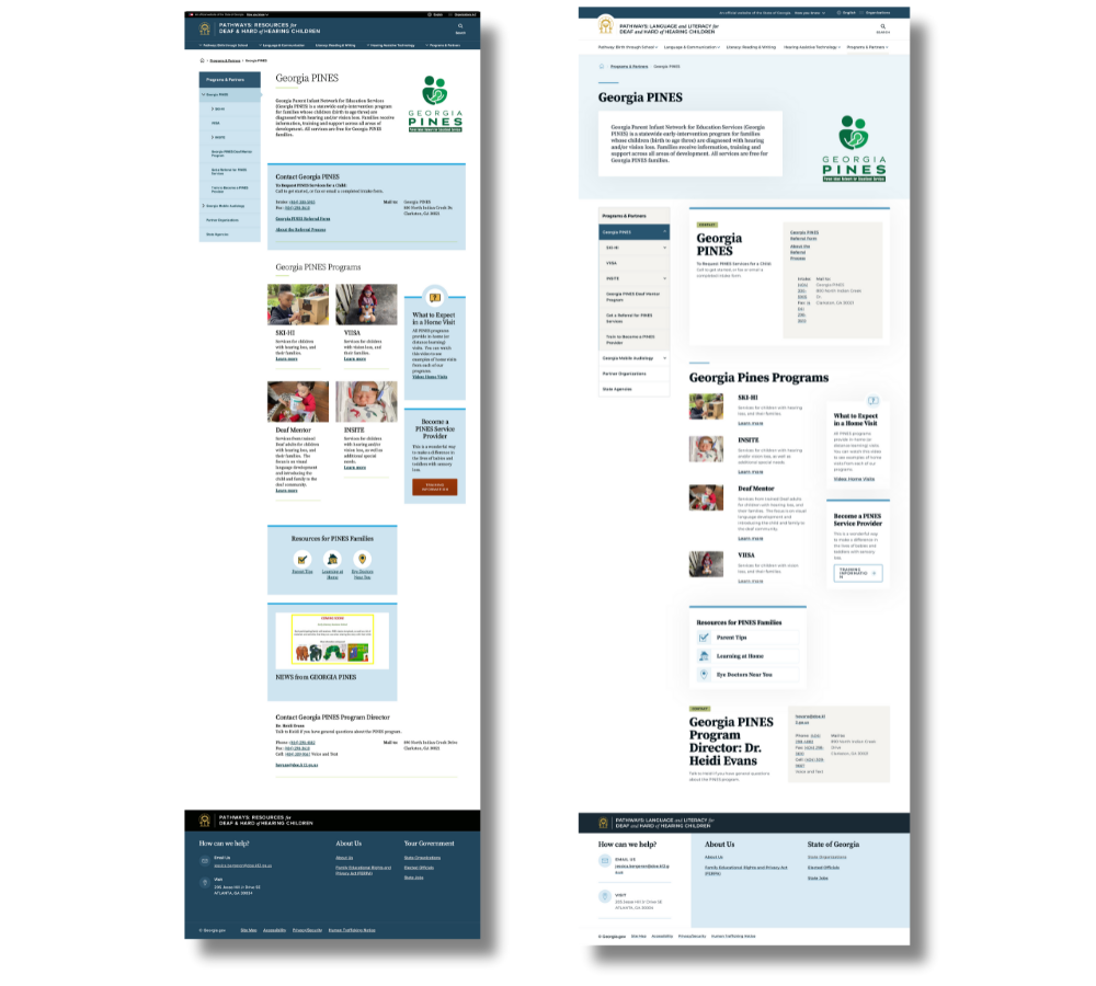
Navigating the landing pages at DHHPathways is a breeze, thanks to the efficient organization and neatly showcased services, reflecting DHH Pathways’ dedication to providing clear and accessible information to its audience.

Environmental Protection Division

EDP before and after
Caption
The Georgia Environmental Protection Division website, sporting the lush and vibrant "State Parks" theme, ensures vital information is just a few clicks away, making the user experience a virtual stroll in the park.

Moving to Georgia

Moving to Georgia
Caption
Lastly, the Moving to Georgia landing page, exemplifies the goals of the Bloom theme: to create visually appealing, user-friendly interfaces that streamline the user experience.

Like What You See? 

We hope you agree that GovHub's recent design update has brought a fresh, modern touch to these agency websites. Our design renovation reflects our commitment to enhancing citizen engagement and improving the overall online presence of government agencies. It is our goal to continue to prioritize user-centered design and accessibility, making government services welcoming and efficient. If you aren’t yet on GovHub but like this design, you can reference the Orchard site for fonts and palette colors. 

    Related to: