rsz_chart_1.png
An official website of the State of Georgia.
The .gov means it’s official.
Local, state, and federal government websites often end in .gov. State of Georgia government websites and email systems use “georgia.gov” or “ga.gov” at the end of the address. Before sharing sensitive or personal information, make sure you’re on an official state website.
Still not sure?
Call 1-800-GEORGIA to verify that a website is an official website of the State of Georgia.
PSG Number: GM-14-005
Topical Area: Web Design and Development
Issue Date: 11/1/2013
Effective Date: 11/1/2013
Document Type: Guideline; Published (approved by Web Standards Group and GTA)
POC for Changes: Georgia.gov Interactive
Synopsis: Mobile guidelines for State of Georgia web sites.
Recent statistics show that mobile Internet growth is doubling every year. Global use of mobile devices accessing the Internet for January 2012 was 8.5% of total online usage (source). From these trends, estimates show that by 2015, more U.S. Internet users will go online through mobile devices than through PCs or other devices. This makes it increasingly important to make sure your website is mobile accessible.
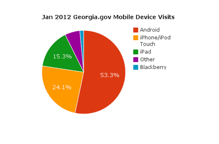
As a point of reference, the following is a breakdown of the mobile devices used to access georgia.gov in January 2012. This is for reference only, and statistics will change over time. Whenever possible, use your own current analytics information to help determine your target audience.
| Device | Percent |
|---|---|
| Android | 53.32% |
| iPhone/iPod Touch | 24.07% |
| iPad | 15.29% |
| Other* | 5.80% |
| Blackberry | 1.52% |
*Other includes Windows 7 devices, non-Android/iPad tablets, and any other mobile device that does not fall under the most common mobile devices.
When talking about mobile accessible web content, it is common to consider developing mobile applications (apps) for the devices. When considering mobile app development, keep in mind the following factors:
With these points in mind, it is important to weigh the factors before deciding whether to develop a mobile app, or to provide all the necessary information from a mobile-compatible website.
See 2.6.5 Case Studies below for examples of good mobile app usage and good use of mobile websites.
In many cases, you can make all your information and services available to mobile users by tuning your website to be mobile accessible.
Ensure that users can perform all the same functions on the mobile site that they can perform on the website, including access to all information and access to creating and managing user accounts on applications.
If there is any content that you think should not be available on the mobile version, ask yourself it it needs to be on the website at all. This extraneous information may need to be removed from the website altogether if you’ve identified it as information that users with a mobile device would not find useful. Similarly, a mobile user should not be expected to switch to a computer’s web browser in order to access some of your site’s content.
Rather than designing, developing, and maintaining a separate Mobile version of the website, consider using a Responsive or Adaptive design technique for your main website. In each design strategy, the same website is tuned using CSS and Javascript to display content in a different layout based on the screen resolution of the device. The same website will have a different layout on a 320px wide device than it will on a tablet that is 800px wide, and again will have a different layout on a desktop with a 1200px screen width (with different device “breakpoints” depending on your layout needs).
All the important content should still be available, but using analytics you can determine which elements are more commonly needed by mobile users. Those elements should be positioned at the top of the screen, while less commonly used items would be further down.
* Note: The Georgia.Gov website is built using responsive design geared towards providing a beautiful and easy-to-use experience customized to mobile, tablet, and desktop device breakpoints. Portal agency templates are not responsive, however they have been built using web-kit mobile-friendly techniques and technologies that performs well on iOS and Android smartphone platforms, allowing the smartphone browsers to fully render those websites utilizing the smartphone’s built-in scaling technologies. The development also avoids Flash and other processor-intensive client-side technologies to allow these sites to perform well across a wide suite of mobile devices.
When developing a website that will be available for mobile and desktop users, consider mobile bandwidth restrictions and be sure to tune your images, fonts, and other bandwidth-intensive elements to be able to load quickly on a mobile device. Whenever possible, a smaller version of each should be available for mobile and tablet devices than what will be downloaded for a desktop or large screen device. At times, you may decide that certain decorative graphic elements don’t need to download and appear at all on the mobile version.
You may want to consider using server-side feature detection scripts to determine the image sizes, fonts, videos, etc., to serve to the site depending on the visitor’s device. When used in conjunction with a Responsive Design solution, this is referred to as RESS (Responsive Design + Server Side Components).
When planning a website redesign, it can be helpful to plan using a Mobile First mindset. In this strategy, you begin by designing and developing the content, layout, and functionality based on what would be necessary for a mobile user. From there you can adjust the design and layout for desktop and large screen devices.
Keep in mind that mobile users will likely be using their fingers to navigate their screen. Design mobile apps and websites with large touch targets and, when reasonable, gestures and finger swipes as well.
When selecting colors and contrast, keep in mind that some portable devices are black and white, and also consider that users may be outdoors with a glare from the sun. Your designs should maintain a high degree of contrast for these considerations.
Minimize the need for typing interactions. For form fields, be sure to apply the appropriate content type attributes (e.g. <input type=”email”>) to enable input type-specific keyboard displays. (For example, on an iPhone or iPad, the keyboard displays an @ symbol in the common keys area when type=”email” and it switches to display a number pad when type=”tel”).
When designing and developing for the mobile web, the idea of testing functionality on multiple mobile devices can get overwhelming. While it is necessary to test your design and development on mobile devices to ensure that your website translates appropriately to mobile, it’s not feasible to acquire and test on every type of mobile device available to users. We recommend taking a balanced approach.
A good first step to testing your website for compatibility is to actually check it’s mobile-friendliness using a validator such as the W3C mobileOK Checker or MobiReady. Once you’ve resolved any issues that arise in the validators, you are ready to move on to testing on devices and emulators.
The vast majority of mobile web users are currently on an iOS or Android device. This means it’s most important to “get it right” on those devices, so testing for them should be done on the devices themselves. There will be behavioral nuances that can only be caught on the devices themselves. If at all possible, you will want to test on the following mobile and tablet devices:
To test how Responsive and Adaptive breakpoints translate to different device sizes, as well as general mobile behavior testing, Mobile Emulators are a good backup testing resource. They still won’t compare with the real devices, and may have their own glitches. However, testing using emulators is preferable to skipping mobile testing altogether. Use your analytics data to determine which devices are the most popular, and test for those. A comprehensive list of mobile emulators is available at MobileExWeb.
GEMA’s iPhone app provides localized Emergency alerts, maps for shelters in case of an emergency, and a number of emergency tips. Its use of geolocation for alerts and shelter location, as well as its offline availability for tips and checklists makes this a prime candidate for a mobile App.
This mobile iPhone app for California residents uses the device’s GPS functionality to help constituents locate government services near them, such as libraries, parks, and DMV offices.
Utah’s State Parks iPhone app uses the phone’s geo-location services to enable users to find parks nearby, and also provides static maps that users can access when they don’t have phone or Wi-Fi service. These two features make it a prime candidate for a mobile app instead of just referring users to a mobile website.
Rather than develop a device-specific app to browse for fishing spots, California’s Department of Fish and Game developed a mobile website that uses large touch-click areas and a mobile style interface to display all the relevant information within a mobile device’s web browser.
Again, rather than develop a specific app for existing website functionality, the Smithsonian developed a mobile-friendly web interface for users to search or browse images of their entire collection online.
11/29/2012 - Removed 2 broken links from "References" section. Updated Testing to list nonspecific iOS versions.
06/02/2015 - Removed broken links from "References" section.