Georgia.gov Information Architecture (IA) Case Study
Scope:
Information Architecture, Usability, Content
Members:
Peter Lee, Bethany Mcdaniel, Rachael Wheeler

The Issue:
Georgia.gov's Menu Wasn't Intuitive
When we launched the new Georgia.gov in 2012, we got rid of the hierarchical menus that were the hallmark of the old Georgia.gov. If you were looking for something, it was probably buried deep within one of the menus.
But we still wanted our menus. Studies showed that half of all Internet users browsed sites using menus, and half used search. So we felt like we had to have something gracing the top of our website.
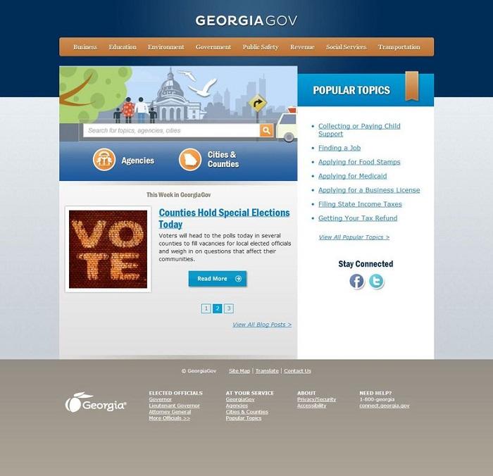
We decided to create landing pages based on eight areas of government: Business, education, environment, government, public safety, revenue, social services and transportation. On those landing pages were links to the most popular topics in those areas, agencies that served those areas, and related news.

We thought we had met both types of customers’ needs.
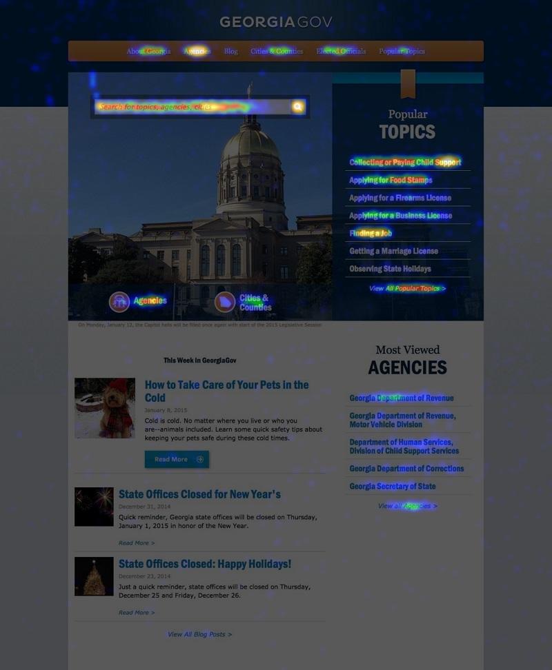
But more testing proved us wrong. Using a tool called Crazy Egg, which maps users’ clicks on a website, we saw that people were “pogo-sticking” across our menu items — clicking on one, then clicking on the next one, on down the row until they found what they were looking for.
The menu wasn’t intuitive, and they weren’t finding what they were expecting. Doesn’t government encompass just about everything? If so, why do you need the other seven topics? What exactly belongs under “Government?”
The Solution:
A Simplified Menu Featuring Top Content
We decided our experiment with creating an information architecture for everything failed for a second time. We turned to Gerry McGovern, author of The Stranger’s Long Neck, who emphasized that when people come to your website, they have a small set of tasks that really matter to them. If they can’t complete these top tasks quickly, they leave.
The problem is, there are tens of thousands of things customers come to Georgia.gov for. How do we try to serve them all?
We already had one tool: Search. The key to browsing, we discovered was to offer up 20% of the content to the 80% who wanted it. In other words, make the most popular content available in your information architecture.
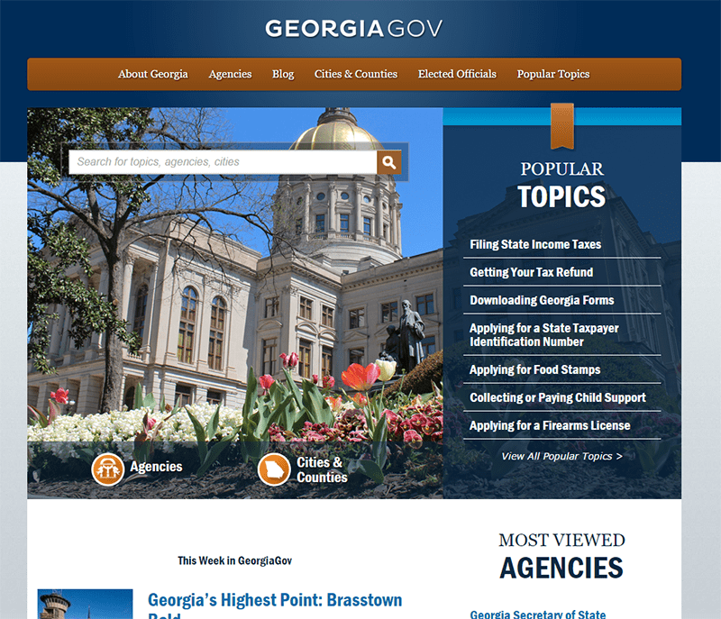
We did away with our landing pages and our eight topics. Now, instead of being presented with a menu of choices that represented the hundred-plus state agencies, we offered up our Cities and Counties page and our Agencies page, two of the more popular pages on our site. We continued to present popular topics on the homepage, but also provided a link in the main menu. The rest of the menu represented what other content we had on the site: About Georgia, Elected Officials, and our blog.
The Results:
Combining Navigation and Search
Data showed that it was easier to navigate to what mattered most and search was a powerful tool for the rest.

By deciding to stop looking at Georgia Government through a lens of bureaucracy and divisions, we were able to focus on what the customer really wanted and gave them precisely that.