rsz_1rsz_georgiagov.jpg
An official website of the State of Georgia.
The .gov means it’s official.
Local, state, and federal government websites often end in .gov. State of Georgia government websites and email systems use “georgia.gov” or “ga.gov” at the end of the address. Before sharing sensitive or personal information, make sure you’re on an official state website.
Still not sure?
Call 1-800-GEORGIA to verify that a website is an official website of the State of Georgia.
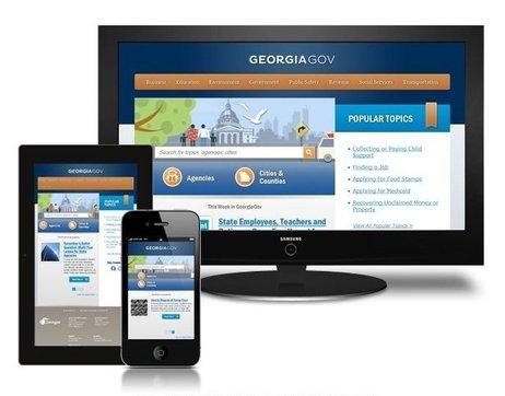
Responsive Web Design is a collection of techniques that changes the layout of a website automatically to fit the screen width of the device that is accessing it. By using a set of queries, the site determines the width of the browser asking for the page, and based on that, the browser delivers a version of the web site optimized for that browser. This mechanism will also rearrange and order the content blocks, images and navigation, depending on the screen width and browser.
With Responsive Web Design, your users will all access the same website, and the layout will change according to the device you are accessing. There isn’t a second “mobile” site.
Try accessing the following sites from your smartphone and your desktop and see the differences in navigation, layout, text sizes, etc.
Georgia.gov is using Responsive Web Design.

bostonglobe.com - Image courtesy of upstatement.com.
Users don’t need to do anything, and neither do you. Everything is automatic.
Only one site to maintain. Using Responsive Web Design means you keep track of only one site. It’s also easier to change or edit content in one place, minimizing risks for content discrepancies.
Saving Time and Money in Development. Developing one website instead of two is cheaper and less time consuming.
Device and browser agnostic. Responsive Web Design techniques work with multiple platforms with most browsers - iOS, Android, Internet Explorer 7 and above, Firefox, Chrome, Safari, Opera, etc. No more “best viewed with...” Users can access the web site from their device of choice.