General Writing

Caption
Part 3 of our blog series on forms. An official website of the State of Georgia.
The .gov means it’s official.
Local, state, and federal government websites often end in .gov. State of Georgia government websites and email systems use “georgia.gov” or “ga.gov” at the end of the address. Before sharing sensitive or personal information, make sure you’re on an official state website.
Still not sure?
Call 1-800-GEORGIA to verify that a website is an official website of the State of Georgia.
February 28, 2017
Forms are an invaluable tool for interacting with and collecting actionable information from any target audience. As with any interaction you have with your audience, it’s important to treat the interaction with respect and consideration, as we explored in my last post. It’s equally important to be sure you build your form in a way that renders the responses you need.
A form interaction is only as good as the prompts and fields you design. If you’re not asking the right questions, or if you aren’t providing the right amount of structure around the answers, you may not get what you need.
What do I mean by that? For example, if you’re collecting contact information to add users to an email list, but you don’t have a field that requires a user input their email address in the proper format, it’s possible for someone to fill out the form without actually giving you that email address. Consider these scenarios for gathering email addresses.
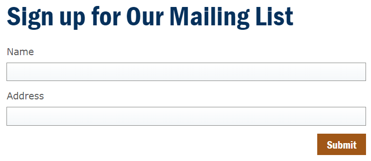
We’ve used the words “Mailing List” but didn’t clarify whether it’s an email list or if we’re sending things through the US Mail.
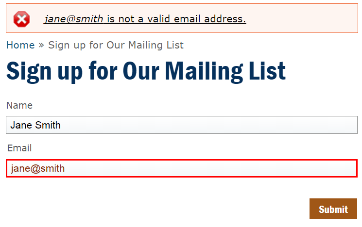
We used the word “Address,” which we know is for an email address, but again, we didn’t clarify. And we’re using a typical text field, which doesn’t validate what kind of information goes into it. In this example, we may get names and email addresses submitted, but then again someone may submit this:
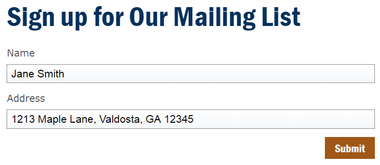
Whoops. That’s useless for our email newsletter.
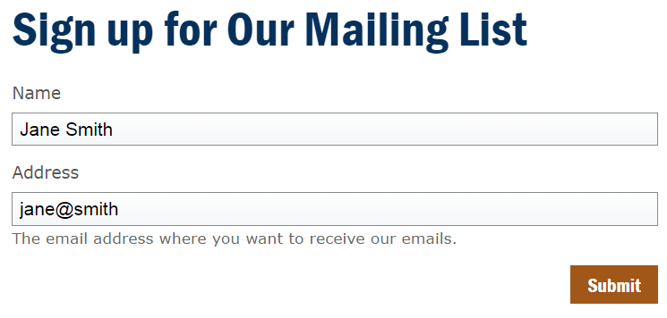
This one is just barely better. All we’ve changed is that we’ve added some Description text, telling the user to enter an email address. We’re still hoping everyone is reading carefully — and we’re not validating to ensure it’s a full email address. We were lucky that Jane read enough to know she needed her email address, but it looks like she forgot to complete it — and without validation, this form would submit and you still wouldn’t have what you need from her.
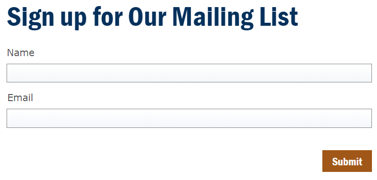
Finally, we’ve used the word “email” to clearly specify what we want, and we even set the field to only accept email addresses. The field doesn’t look any different from the other one — except now it will only accept a submission if the information type is valid:
With the right terms and the field validation, we’re much more likely to get valid responses to our questions:
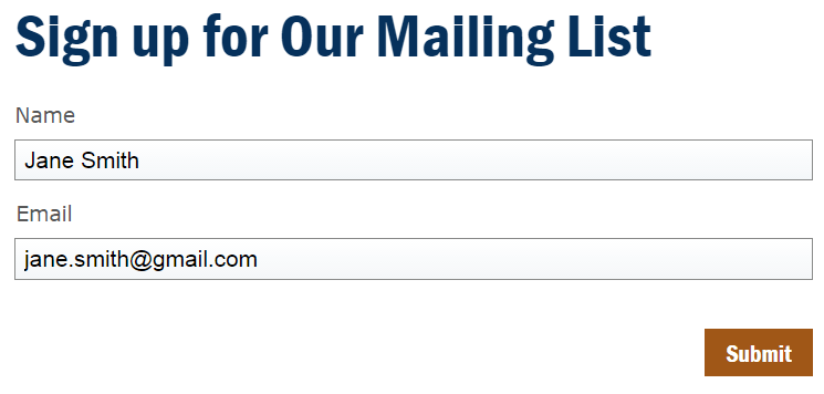
Phew! Finally, we can send some emails!
As you can see, even in a simple, seemingly straightforward form, the words you use and the prompts you provide can make a difference between whether or not you get what you need from your respondents.
Understanding what you need is only part of the technological battle. We also need to remember that our users will all be using different devices to answer. As more and more of our audiences use their mobile devices to complete transactions and browse the web, we need to make sure these forms are easy to answer from a mobile device. It can be amazingly difficult to complete a transaction on mobile when visiting a desktop-centric website. Similarly, it’s important to make sure your forms can be completed using only a keyboard to tab from field to field and select options (no mouse-clicks).
So what steps can we make our forms usable, user friendly, and get valid data? By choosing appropriate input types, adding clear labels, and setting validation rules in your form fields you can make your forms easier to use for keyboard only users, mobile users. The tips we cover today will aim to accomplish all of that.
I’ve said it before but it’s worth repeating. Only ask for what you need. If you’re adding people to a mailing list and all you need is their name and email address, only ask for name and email address. Don’t ask for their job title, for instance, unless you’re actually going to create separate mailing lists and send separate emails to specific roles. Then,
There will be times that you’d like to give someone the opportunity to answer some questions, but you can live without that data. In that case,
That distinction should be marked with form validation, so a user can’t continue without filling in required fields. An asterisk can indicate that a field is required, but it’s even better if you can add in the word required to be clear.

The asterisk indicates these are both required fields.
You’ve probably heard the phrase, “Garbage in, garbage out.” In it’s simplest form, it’s a reminder that our data is only as useful as what we were given. For our purposes, that means our form field settings should match the type of information we need, to make sure we get valid, useful answers submitted.
Most form builders (including ours on the GeorgiaGov Platform) allow you to specify the kind of answer you expect, so it can validate it for you. For example:
Not only does choosing validation options keep you from getting words when you need a number, for example, but it can also prompt a mobile device to switch to a number keypad, or make the @ symbol readily available, depending on the type of field.
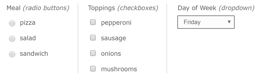
Similarly, whenever you have a finite list of possible answers to a prompt, you can constrain the responses to those you are expecting with select lists — radio buttons, checkboxes, or dropdown lists. What’s the difference you ask?
Radio buttons and checkboxes both make all the options readily visible — which can be easier to use and makes it quicker for someone to process how to answer, when you only have a few possible choices. Radio buttons limit a user to picking one — so when you can only order one meal, or sign up for one timeslot. Checklists are good when someone may have more than one answer — if you can add multiple pizza toppings, or have parents of more than one nationality.
Dropdown lists are good when there are many items to choose from, but that list is still finite, and the user can still only select one. This is useful if the options are still pretty intuitive and can go in a logical order. They’re harder to use than checklists or simply typing in an answer, but still have their place. Common uses for dropdown lists are when choosing your state, country, day of the week, or month of the year.
After all this talk about validating data, there are some instances where you should be as flexible in your fields as possible. One of those times is when asking for someone’s name. How will you use that name? If First Name and Last Name don’t need to be separate fields in your data, only use one Full Name field. But, if you will be using it to refer to them by their first name in automated emails, for example, or have other reasons to use just first or last name data, separate them out. And leave the text fields on these as loose as you can. Don’t limit the number of characters allowed in a name field, and don’t limit the type of characters. People have all kinds of interesting names — not everyone has a “simple” name like Jane, Keisha, or Robert. Numbers, hyphens, apostrophes, spaces, and other special characters do show up in names, even if infrequently. It would be a shame to completely cut them out of your data for being unique.
Finally, there are some simple steps you can take as you create your form to ensure the answers are readily accessible to screen readers, keyboard-only users, mobile users, and autocomplete features on browsers. In some cases, these settings may even be used to convert a form to a conversational interface (think Amazon Echo or Google Home).
In this series we’ve covered a lot of the best practices around form design. As is the case with most interactions with other people in this world, there are so many options and so many things to consider to get the best result from those interactions. Where forms differ from conversations, however, is that we are separating the question portion of the interaction from the answer portion. They’re happening at different times from different locations. So the more we can anticipate friction points or possible responses to our questions ahead of time, the more likely we are to accomplish our goals, whatever they may be.
To recap: better forms start with empathy and consideration towards the humans who will be filling these out. Then when creating the fields, better forms benefit when you are clear with what you need, validate fields that have limited response types, and mark your input fields with labels, keys, and descriptions. Finally, they rely on the appropriate level of privacy and security of the results relative to the information you gather.
 Form
Etiquette Checklist
(printable) from Form Etiquette, Part 1: Four Checkpoints of Form Etiquette,
Form
Etiquette Checklist
(printable) from Form Etiquette, Part 1: Four Checkpoints of Form Etiquette,
Form Protocol Spreadsheet (template) from Form Etiquette, Part 2: Every Question has a Cost