Claro intro
An official website of the State of Georgia.
The .gov means it’s official.
Local, state, and federal government websites often end in .gov. State of Georgia government websites and email systems use “georgia.gov” or “ga.gov” at the end of the address. Before sharing sensitive or personal information, make sure you’re on an official state website.
Still not sure?
Call 1-800-GEORGIA to verify that a website is an official website of the State of Georgia.
February 25, 2021
GovHub gives you the tools you need to move your content off your to-do list and onto your website. And with the new Claro visual design system in place, that process will be easier than ever.
Designed by Drupal core, the new Claro theme is not only more visually appealing, it also makes it easy to find important elements on the page. Additionally, because it was created with WCAG standards in mind, it improves accessibility.
When we talk about visual styles, we’re typically referring to the end-user experience on a website. We’ve done a lot of work via GovHob’s Orchard design system to give Georgia’s websites the right look and feel. This is an ongoing and evolving effort to make sure the people who visit our sites have a great experience.
But what about GovHub’s site editors? Shouldn’t you have an equally enjoyable experience? Absolutely. And that’s where Claro comes in.
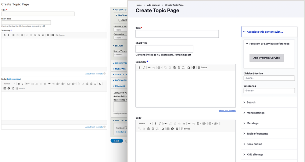
A backend user interface with a visually clear, clean, and concise design, Claro will make your daily to-do’s a lot easier … to do. This upgrade changes nothing on the frontend of your website. You’ll only see the new styling when you’re logged into the backend of your GovHub website, when you’re viewing pages like the content library or a content editing screen.
The less you have to focus on GovHub’s design, the easier it will be for you to focus on your tasks. No need to get out your reading glasses — Claro’s base font size is 16 pixels.
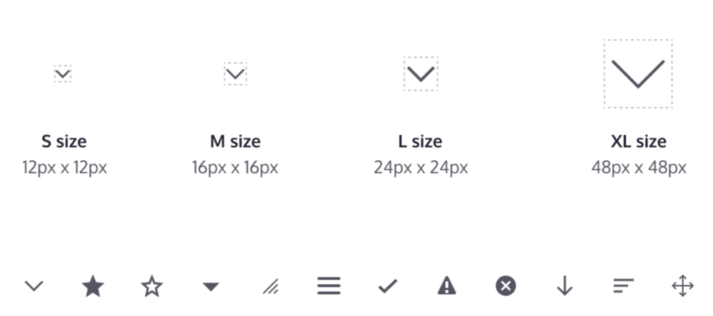
You don’t need a new interface to slow you down, so Claro judiciously scales padding and margins to help you quickly scan a page and find what you need.
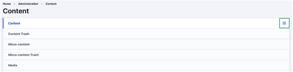
One of the most obvious changes inside Claro is the look of libraries on a laptop’s smaller screen. The bug that used to display libraries in a tangle of tabs has been reformed into a hamburger menu. The new menu reveals all of the libraries, micro-content, media, documents, etc. in a tidy dropdown.
Well, the Claro theme doesn’t talk to you like Alexa (at least not yet), but we like to think it provides a cheerful and serene environment for your daily work. To achieve this, the color palette incorporates a vivid blue softened with a wide selection of grays.
In addition, all links are underlined and focus areas kept consistent for improved accessibility for anyone working within Claro.
These are just some highlights of prominent changes. There are plenty more to discover, so we encourage you to learn more about Drupal’s Claro theme.
In many ways, this update comes straight from Drupal core; but we at DSGa take nothing for granted. Before passing this update through to GovHub, we tested its usability with our content editors to ensure it wouldn’t affect GovHub’s performance. We also spoke with a number of editors to get feedback on the update. We wanted to ensure Claro would help you with your work, not get in the way of it (or worse, create more).
Like any of DSGa’s products, we’ll be working to continually enhance and improve the GovHub editor experience. So, if you have any feedback on the new theme, feel free to open a support request. You can also get in touch with us via the “Send Feedback” link that’s at the top of every GovHub page when you’re logged in.