Orchard Illustration - Part 2
An official website of the State of Georgia.
The .gov means it’s official.
Local, state, and federal government websites often end in .gov. State of Georgia government websites and email systems use “georgia.gov” or “ga.gov” at the end of the address. Before sharing sensitive or personal information, make sure you’re on an official state website.
Still not sure?
Call 1-800-GEORGIA to verify that a website is an official website of the State of Georgia.
June 26, 2020
If you like typography or are font nerds like us, this is your type of post. In Part 1 of this blog about our Orchard design system, we covered the broad strokes of what design systems are, what Georgia created, how the system is integrated into GovHub, and our plans for future integrations.
Part 2 of this blog is going to focus on our fonts and typography: what we designed, why we designed it this way, and how this system is different from just about anything else you might have come across. We’ll cover the new font technology we’ve embraced, some new ideas in typography and techniques in cascading style sheets (CSS), and how it all makes a positive impact on web performance and accessibility.
Whereas a design system is comprised of color, form elements, content components, typography, and layout, the typographic system can be thought of as a foundation for the larger whole. It serves as a unifying layer across layout, individual components, and screen sizes. The system is made up of the typefaces and fonts selected; the sizes, weights, and variants used; and the way they all scale across screen size and layout placement.
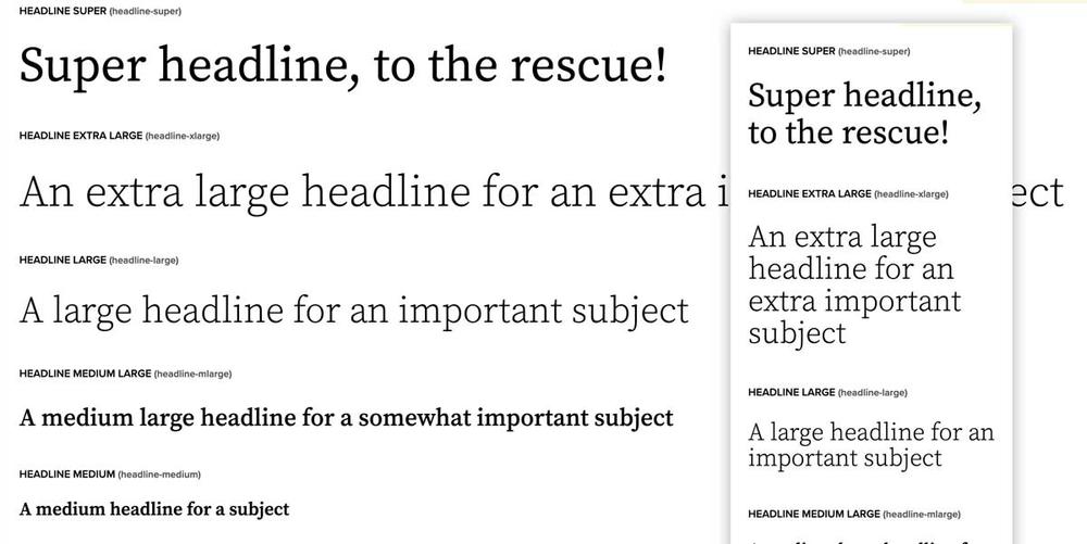
The term “typeface” refers to the design of a set of letters. Historically, in the days of metal and wooden type, a font has referred to a specific size, weight, and style of that typeface. More recently in the digital age, it usually means “the computer file you install that will render the bold weight of the typeface” (or perhaps “Light Italic”). After years of arguments about the correct usage of either term, variable font technology makes them one and the same. In the case of GovHub, we chose two typefaces, each featuring several fonts in order to create the whole system.
As noted in Part 1 of this post introducing the Orchard design system, we selected Source Serif from Adobe and Proxima Nova from Mark Simonson as our two typefaces. We picked several weights and variations to support the design: a regular and a medium weight of Proxima Nova; and light, regular, semibold, and italic versions of Source Serif. These are used throughout the platform to provide a clear, consistent visual hierarchy and presence as visitors travel from one GovHub site to the next. Even as color palettes and imagery change, the consistency of typographic treatment helps visitors feel at home no matter what GovHub site they’re on.
That’s the power of a good typographic system: By always using consistent size, weight, and treatment, visitors know which element on screen is important and can follow that visual hierarchy around, letting it guide them through the tasks they’ve come to accomplish.
The most recent evolution of the OpenType standard, variable fonts combine all the different permutations of a typeface design into a single, very efficient file rather than requiring separate files for every width, weight, or variant. This means that, instead of loading 8 files to represent Source Serif’s full weight range of 200-900 (totaling more than 540kb of font data), we can load a single file of about 150kb and have the whole range available all the time.
Less font data means web pages load faster, and more font-weight range means we can achieve greater “vocal range” in our design — creating a clearer visual hierarchy that can be modulated based on both font size and screen width. These are two significant improvements that weren’t easily attainable before this technology. Web browser support is now more than 90%, and with just a little extra effort, we’ve implemented them without sacrificing support for the rest.
The rollout of GovHub with variable fonts represents the largest implementation of this technology to date.
The premise of responsive typography is that it should scale between elements as well as across screen sizes. It should add to the user experience even before the web fonts load, and then make the UX even better when they do. However, this previously required the use of a lot of intermediate steps to scale font-size and line-height as screen sizes changed. Dynamic typography embraces some additional new technologies in CSS to make it all work better across an even greater range of screens.
We’ve used two additional newer features in CSS: custom properties (also referred to as variables) and calculations. This combination allows us to set variables for minimum and maximum values for font-size and line-height. Then, rather than using breakpoints based on screen width to trigger changes in those values, we can use a calculation to smoothly scale from the lower value to the higher one based on screen width. This way, no matter what new devices come out in the next few years, the whole typographic system will smoothly scale and maintain the hierarchy and proportions we designed.
This is a big shift in how we’re thinking about typography: rather than focusing on specific point or pixel values, this technique relies on relative proportion. So long as the information hierarchy is clear, we don’t have to worry about specific sizes at any given screen width. When combined with variable fonts, we have the added dimension of scaling font-weight based on screen size. This helps ensure text is always legible and clear. Bold text doesn’t need to be quite so bold when mixed with body copy on a phone versus on a larger-screen desktop. By slightly reducing the font weight for smaller font sizes and screens, we maintain emphasis without sacrificing clarity.
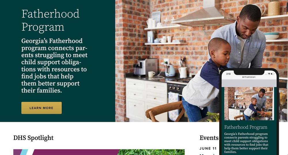
There are many ways the Orchard design system can be customized from one state agency site to the next, but the typography stays consistent. In deciding to allow variation of color and imagery, we give agencies the freedom to differentiate themselves. But by keeping the scale and style of typography consistent, visitors to Georgia government sites experience a common visual language that helps them find their way and builds trust in the system. The development process included research, testing, and finessing to ensure text is readable and accessible.
It’s easy to understand how Georgians benefit from Orchard’s visual consistency. Well, agencies benefit too! Since our research shows that typical citizen interactions involve visiting multiple agency sites to complete a task, providing consistent visual language and typography helps build confidence and trust in the network of sites, leading to increased trust in the agencies themselves. The second benefit is for the content authors. By including text styles based on use rather than specific fonts and sizes, the authoring process goes faster, with more consistent results.
This approach has had some remarkable benefits for our web development team. We separated the system and code into several parts so it’s easier to update and understand. We have one place to define size ranges, one place to edit sizing formulas (and their fallback solutions for older browsers), and can then apply the size range and style code to the text elements. This allows web developers to apply the same kind of styles for lists, headings, buttons, links, etc. regardless of how the underlying HTML or content may change.
In the future, this will help developers apply the GovHub design and typographic system to other digital products and applications for a seamless user experience. Our goal is to always provide a high-quality design and user experience across all avenues of digital interaction between our government organizations and the citizens of Georgia.