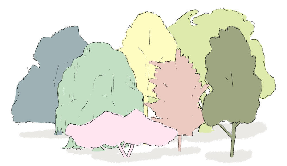
Orchard Illustration
An official website of the State of Georgia.
The .gov means it’s official.
Local, state, and federal government websites often end in .gov. State of Georgia government websites and email systems use “georgia.gov” or “ga.gov” at the end of the address. Before sharing sensitive or personal information, make sure you’re on an official state website.
Still not sure?
Call 1-800-GEORGIA to verify that a website is an official website of the State of Georgia.
June 11, 2020
One of the biggest challenges in creating unified systems of websites — for universities, corporate families, or government — is finding the balance between cohesive unity and unique differentiation. Providing enough similarity so that sites feel connected and “in the same family” while still allowing them to feel distinct. A good design system balances user needs and the site owners’ desire to maintain a differentiated identity. We created our design system and named it Orchard with just this balance in mind: letting the trees be unique while still belonging to the same forest!
In simplified terms, a design system is the collection of the colors, typography, content patterns, and styles that define a brand or user interface (you can read a whole lot more about them in this free eBook from InVision). On the web and in applications, that generally includes all of the above coded into a style guide or pattern library that defines the user interface across multiple sites or platforms. We built the design system in PatternLab, which is a widely used tool with lots of contributors. This helps ensure that the tool and system can keep up to date and still evolve over time.
Brand standards manuals have been produced for decades (check out this PDF version of the NASA one) and they document color palettes and usage, typeface styles and sizes, and guidelines for photography and content writing styles. In NASA’s case, even how you would apply the logo to your Space Shuttle is included. Until very recently, what tended to be missing from these manuals was how the standards would translate to a mobile site. Digital design systems consider all the ways the brand must be presented across devices and applications. They must define appropriate color contrast, type scales and font alternatives, and examples of different content patterns like blog post lists, product pages, and search results. For many brands, this defines a single set of styles used in every application, but it gets more complicated if we’re talking about satisfying the needs of 80-plus state agencies while establishing a core consistency.
Beyond the basics of color and type, a good design system contains common patterns for image treatments, list styles, icons, and the various different kinds of “teasers” needed to list and promote content on the sites. This includes larger content teasers often found on homepages or blog posts, to simple title-and-date combinations used in lists. Each one of these elements is a component, with defined ways in which they can be customized. This is how design systems balance the needs of consistency and character.
There are a few things that help Orchard stand apart from many other design systems. Color palettes and the typographic system are two we’ll cover here.
We started with a core set of colors to represent the brand for Georgia state government, then built on the initial set to create a full library of primary, secondary, and accent colors. We then grouped the sets of primary and accent colors to create a number of accessible palettes from which an agency could choose for their site.. We kept the text and link colors consistent (with options for light-on-dark or dark-on-light) and set about creating a wide range of options for background and accent colors. In each case we paired the appropriate text color so the system itself could enforce proper contrast between text and background.
This gives each site owner the ability to customize the colors they use globally and on a per-component basis, ensuring that every site can be unique while still belonging to the same design family. Our research shows that Georgians interact with several different state agencies during the course of routine tasks. We wanted our design system to provide visual consistency as users clicked from one website to the next. This helps build trust and lets users know they’re still within the state government digital ecosystem.
The bedrock of the design system (and, it could be argued, of any design system) is the typography. We settled on an open source typeface from Adobe called Source Serif, with Mark Simonson’s Proxima Nova as the accent for navigation, captions, and other bits of interface text. This helps keep the focus on the text content, and provides a predictable anchor for citizens traversing multiple agency sites.
To help maintain consistency, we simplified the content editing tools and only permit use of preselected styles for content authors rather than allowing them to pick their own fonts or sizes. A key element of a good typographic system is limiting the number of variations in styles and sizes. This helps promote consistency and builds familiarity for users with what level of importance should be attached to various styles and headings. When dealing with dozens of sites and thousands of pages, it’s crucial the experience maintains these kinds of touchpoints.
One of the other key elements of the system is how we manage the scale of type sizes between text elements and across device screen sizes. Basic typographic hierarchy describes how elements relate to each other: this heading is bigger or bolder than that text, signifying greater importance. The specific size or weight is less important than the relative difference between them. As screen sizes change from phone to tablet to full-size computer monitors, we can scale the system proportionally, maintaining relative hierarchy while still presenting content in a manner appropriate to the device upon which it’s being viewed.
Design systems are meant to be part of a modular solution, and PatternLab is a well-tested and highly regarded tool to help make that work. We built Orchard in PatternLab specifically because there are already a number of Drupal themes that integrate the modular design framework of the design system with the modular content framework that is Drupal. The standard Drupal theme templates act as the glue that connects content and design components.
This is generally enough to connect the design system with the content, but since we wanted to add more design flexibility at the site admin level, some custom module work was required. This allowed us to build in some theme flexibility with the color palettes that could be accessed and changed on a per-site basis — greatly increasing the overall system capabilities and potential for unique combinations of color, image, and layout. This way, the site administrators could control many aspects of the design in addition to the menu structure and all of their content. All without writing a line of code!
We know there will always be other systems — job sites, applications, and other third-party platforms — that are related to Georgia government but don’t exist within GovHub. The true value of the design system will be in extending its use to these other platforms. While we’re focused initially on GovHub, our goal is to make the system available to be used in many more ways in the future.