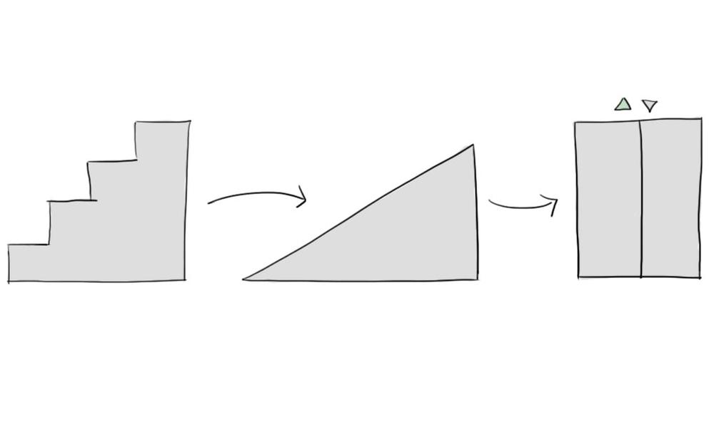
Illustration: Curtain Accessibility
An official website of the State of Georgia.
The .gov means it’s official.
Local, state, and federal government websites often end in .gov. State of Georgia government websites and email systems use “georgia.gov” or “ga.gov” at the end of the address. Before sharing sensitive or personal information, make sure you’re on an official state website.
Still not sure?
Call 1-800-GEORGIA to verify that a website is an official website of the State of Georgia.
October 05, 2015
This is the second in a 3-part series on what we're doing behind the curtain.
In case you missed it, in Part 1 of this series I explained our methodology behind selecting enhancements for the GeorgiaGov web platform. Today I want to tell you a bit more about the process we’re following to improve on the platform code with accessibility in mind.
We’ve been talking to you a lot about the importance of making accessible websites, and things that you can do to make your web content and PDFs more accessible. At the same time, the product team at Digital Services Georgia has been working with AMAC Accessibility to identify things we can do from the platform side to make the underlying markup — the HTML and CSS of the platform — more accessible.
Users First. When I say our goal is to serve our site users first, I mean all of them. In theory, agency websites should be the easiest way for users with low mobility, low or no vision, or trouble communicating to gain access to state resources and information. But in reality, if our websites aren’t built with accessibility in mind, it creates real barriers to some of the users who need them the most. These accessibility improvements are meant to be nearly invisible to most of our users, yet for the users who need them, these improvements can make a world of difference in the ease and speed at which they access information on our websites.
I wish I could say we’re accessibility experts here at Digital Services Georgia, but while we’ve been learning more about ways to make our sites more accessible, it’s not what we focus on daily. We had accessibility testing done on the platform as we built it, so we aren’t starting from zero. But we still knew we had room for improvement. So we were excited to be able to partner with AMAC Accessibility to get comprehensive reports on the accessibility of our themes and templates.
What we've found is that we’re already doing a lot of things right for users with accessibility needs. We have a Skip to Content link at the top of each page that allows a user with a screen reader to jump further down the page. We apply alternate text to images when appropriate (such as when the image contains text, or provides value to the other information on the page), and leave the alt text blank for decorative images. Our navigation is easy to tab through using a keyboard, and with our responsive layout, the text remains easy to read even when zoomed to 200% size — we don’t have part of our paragraphs falling off the right edge of the page.
AMAC has also helped us identify places where we can improve on the experience for users using a screen reader, navigating with a keyboard, or with limited vision.
Some areas for improvement that we’ve been able to implement pretty easily include:
These are just some of the improvements we’re making to the platform. As part of our commitment to continuous improvement, we’re prioritizing the quick fixes and the items that have a greater impact on user navigation, and getting them updated on the platform now. Then we will continue to work on the accessibility items that we’ve identified as requiring more effort, and roll them out in later releases.
Some of the items that will require more time and effort (but are still priorities to implement sooner rather than later) include:
As I mentioned earlier, most site visitors won’t even notice these changes, such as when your coworker gets new glasses and you can’t quite pinpoint what’s different about him or her. So it would be easy for you to miss these altogether. But we know that our agency customers want to know what we’re up to, so if you subscribe to our newsletter, you will receive email updates with release notes detailing each round of enhancements to the platform as they’re released.
Of course, none of these improvements will matter much if the content of these websites isn’t accessible. So as always, I want to encourage you — our agency content managers — to dig through your content, prioritize the popular pages, and make sure you’re focused on accessible content as well. Together we can help Georgia government websites provide access for all.